Streamer logo and channel identity: character or lettermark, and how to choose colours
A logo and identity guide for Twitch/Kick/YouTube channels: mascot/character logo vs lettermark, readability at 28 pixels, choosing a palette, typography, the channel name–character–games triangle, and how the identity spreads across overlay, emotes and banner.
Channel identity is the sum of what lets a viewer recognise you in one second: logo, character, colour, typography, and all of it repeating in the same language from overlay to emotes. The logo is the core of this system — but on its own it is not the identity.
Character or lettermark?
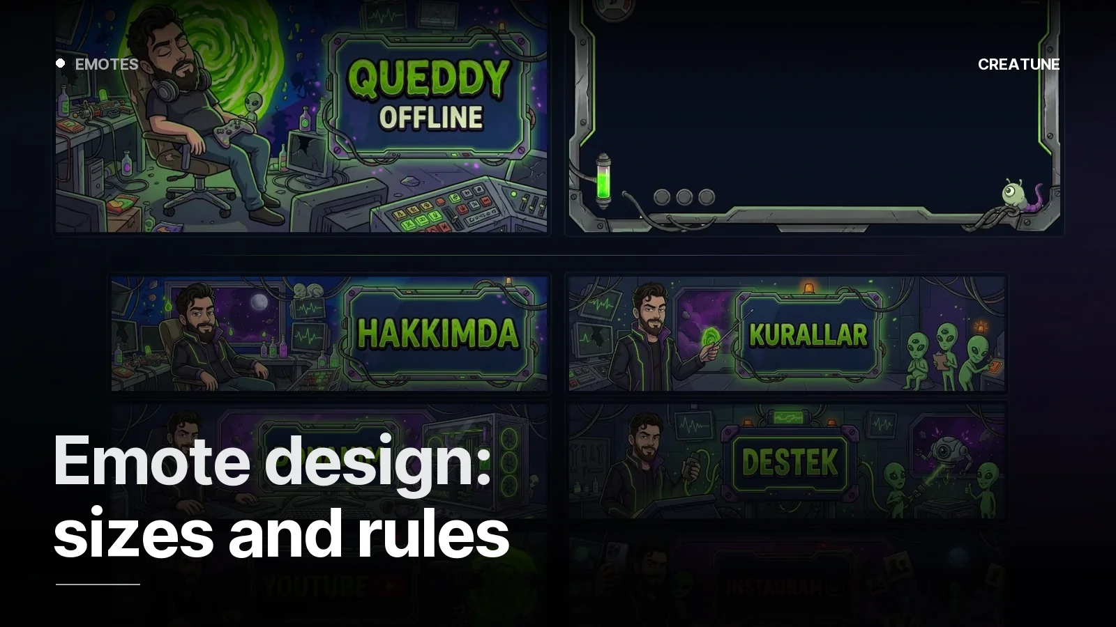
Character / mascot logo: when the channel revolves around a personality. A streamer who reacts, talks with chat, has humour. The character carries straight into emotes, the Starting Soon screen and the animated profile picture. Aurcorf's fox and Queddy's cartoon character are this.
Lettermark / emblem: when the channel revolves around a game or genre — tournaments, guides, esports, "quiet gameplay" streams. Xenith's metallic phoenix, Anysra's minimal fire logo.
For most channels the right answer is both: the emblem in small spaces (profile, badge, watermark); the character in large ones (banner, offline, Starting Soon). Drawn in the same language they complete each other.
The 28-pixel test
The place the logo will be seen most is the tiny profile circle in chat. Rule: if it isn't recognisable at 28 pixels, it isn't a logo. For that:
- One closed silhouette (form, not detail)
- Thick outline, at most 2–3 colours
- If there is text, uppercase and no longer than 3–5 letters; a long channel name lives separately as a wordmark
- A composition that does not get cut in a circular crop
Colour palette
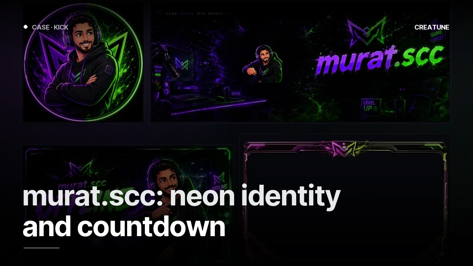
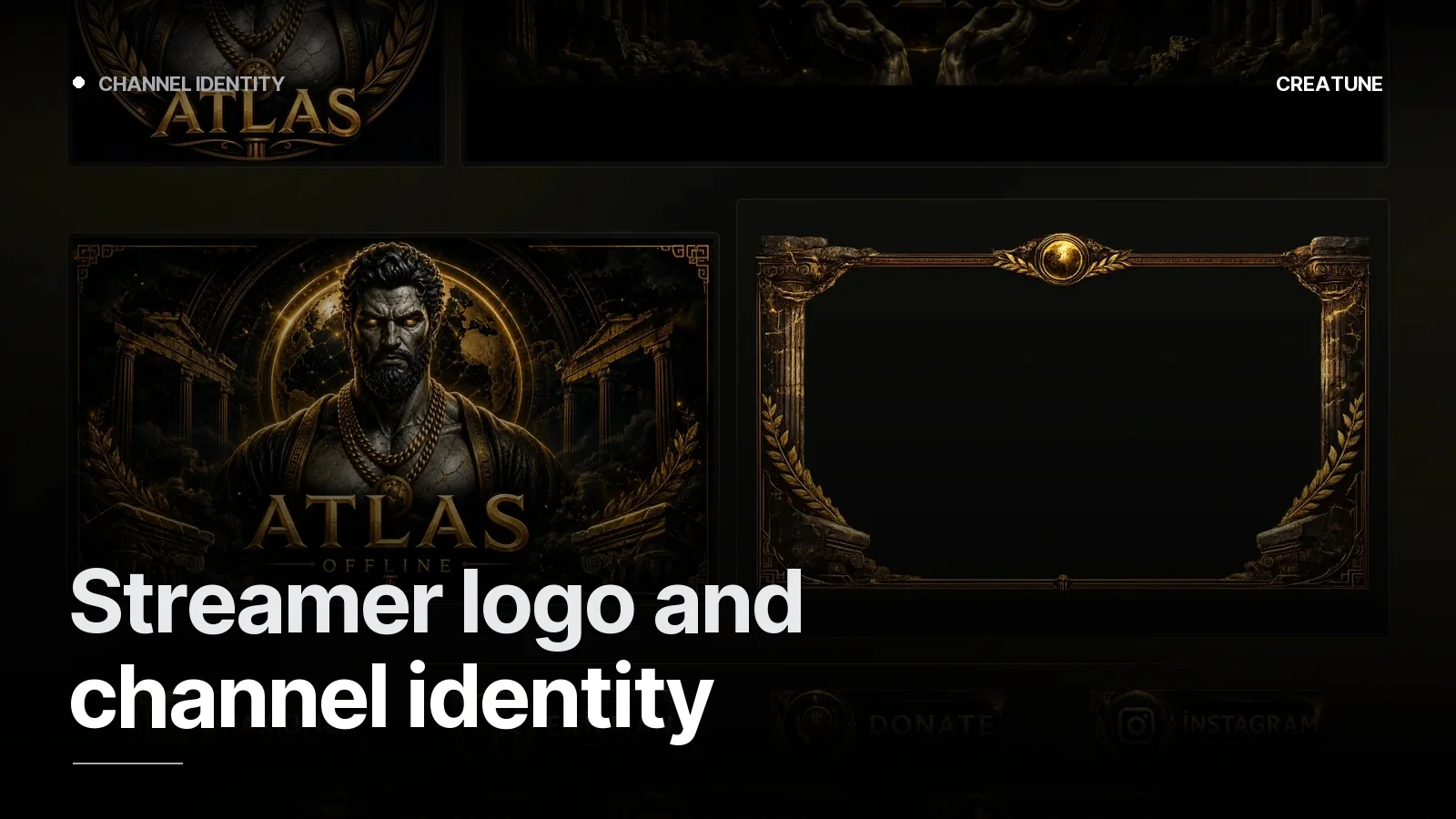
Three colours are enough: main (identity), accent (for attention, close to the opposite of the main) and ground (dark). The main colour comes from the character or genre: red-black for a horror channel, pastels for a cosy channel, cold blue-orange for FPS. Not clashing with the platform UI matters: a main colour that disappears on Twitch purple or Kick green makes the channel invisible. Atlas with antique statue + gold, murat.scc with purple-green neon — both separate from the ground.
Typography
One display typeface (with character, for banners and screens), one body typeface (readable, for panels). Stay away from "fantasy" fonts that fit the genre but cannot be read; every letter must be legible in a 320-pixel panel.
How the identity spreads
| Place | Logo | Character | Colour / type |
|---|---|---|---|
| Profile (Twitch/Kick/YouTube) | emblem | — | main colour ground |
| Banner | wordmark | yes | full palette |
| Offline screen | emblem + wordmark | yes | full palette |
| Overlay | small emblem | optional, in a corner | accent colour |
| Panels | — | icon language | display typeface |
| Emotes | — | yes (same line) | palette |
| Starting Soon / stinger | emblem animation | yes | palette + sound |
| Social media kit | emblem | yes | palette |
This table is also the content of our packages: the identity is built once and applied to every piece. Channel name, character and games are asked in the brief; the design comes out of that triangle.
Common mistakes
- A "ready-made mascot" from Pinterest — the same on ten other channels
- A different logo / colour on every platform
- Small text, dates or slogans inside the logo
- A character unrelated to the channel name (nobody can connect them)
- A main colour identical to the platform's
For a channel identity, send your channel link on WhatsApp; character, emblem or both — we will tell you once we see the channel. Packages: Stream packages.
Frequently asked
1.Should a streamer logo be a character or text?
If the channel revolves around a personality (reactions, chat, humour), a character/mascot logo; if it revolves around a game or genre (tournaments, guides, esports), a lettermark or emblem is more accurate. For most channels the best answer is both — the emblem in small spaces, the character in large ones.
2.What does "readable at 28 pixels" mean?
The profile icon in chat and emotes are shown at around 28 pixels. For the logo to be recognised even at that size, use one silhouette, a thick outline and at most 2–3 colours; thin lines and small text vanish there.
3.How do I choose a channel colour palette?
One main colour (identity), one accent (attention) and a dark ground. The main colour comes from the channel character or game genre; the accent is chosen close to the opposite of the main. A main colour that does not clash with Twitch purple or Kick green keeps the channel distinguishable inside the platform UI.
4.Is logo design included in the packages?
Yes — every Creatune stream package includes the channel icon / profile image; the channel character and full logo system are part of the identity in Deluxe and Ultimate. For a standalone logo, message us on WhatsApp.