YouTube banner design and thumbnail system: safe area, click-through, consistency
How to use the 1546×423 safe area of a 2560×1440 YouTube banner, how profile, banner and thumbnails become one identity, the thumbnail system (a rule set, not a template) that raises click-through rate, and the YouTube channel identity package.
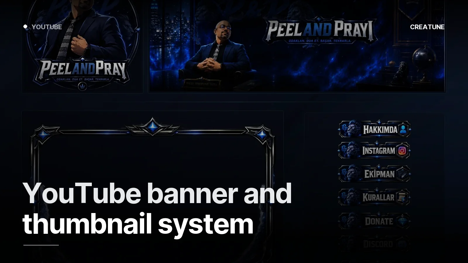
On YouTube the channel page is a shop window and the thumbnail is the sign on the street. When the two speak the same language, a viewer sees a video in the feed and thinks "that's that channel". The system we built for PeelAndPray is exactly this: banner, profile and thumbnail template as one identity.
Banner: using the safe area properly
| Device | Visible area |
|---|---|
| TV | 2560×1440 (all) |
| Desktop | 2560×423 (horizontal strip) |
| Tablet | 1855×423 |
| Phone | 1546×423 (safe area) |
Rule: channel name, tagline, schedule and social icons inside 1546×423. The outside is for texture, colour and character. The most common mistake is a banner that shows half the channel name on phones.
YouTube's link buttons sit over the top right of the banner — leave 300 px empty on the right edge.
Profile: a logo that reads in a circle
Upload 800×800, shown at 98 px. Channel logo or portrait; if there is text, 3–5 letters. Channel identity guide.
Thumbnail system: a rule set, not a template
Click-through rate (CTR) is raised by a consistent system, not by one "nice thumbnail". The parts of the system:
- Fixed face / expression position — right third, 40% of the frame. No face? Product/object in the same spot.
- 3–4 words, one bold typeface — must read at 160 px wide on a phone. A hook, not a sentence.
- 2 + 1 colours — channel palette plus a contrast ground. Yellow-black, white-red.
- Series tag — a small badge in a corner: "EP 12", "GUIDE", "STREAM RECAP". It presents the series in the feed.
- Contrast and sharpness — a blurry thumbnail in a small preview does not get clicked; sharpening plus edge light.
- Empty space — the duration label sits over the bottom right corner; no text there.
The system is delivered as a Photoshop/Figma template: new video = swap the face, type three words, export. Five minutes.
In-video assets
- Watermark 150×150 PNG (over the subscribe button)
- End screen 1920×1080: safe space for two videos plus the subscribe element
- Intro ≤5 s — logo intro guide
YouTube sizes (short)
Banner 2560×1440 (safe 1546×423, 6 MB) · profile 800×800 · thumbnail 1280×720 (2 MB) · Shorts thumbnail 1080×1920 · watermark 150×150. All platforms: Streamer image sizes 2026.
For a YouTube channel identity, send your channel link on WhatsApp; the packages are delivered at YouTube sizes too.
Frequently asked
1.What are the YouTube banner size and safe area?
The banner is uploaded at 2560×1440 pixels; TV shows all of it, desktop a 2560×423 strip, phones only the central 1546×423 pixels. Channel name, tagline and schedule go inside that safe area only. File limit 6 MB.
2.What is a thumbnail system?
Instead of designing every thumbnail from scratch, a fixed set of rules: same typeface, same 2–3 colours, same face/expression position, at most 3–4 words, series tag in the same corner. Viewers recognise the channel from the thumbnail; thumbnails that appear as a series in the feed raise click-through rate.
3.Can a thumbnail be something other than 1280×720?
16:9 and at least 640 px wide are required; the standard is 1280×720, under 2 MB, JPG/PNG. A vertical 1080×1920 thumbnail is uploaded separately for Shorts.
4.Is there a package for YouTube?
Yes — Creatune's four stream packages are also delivered at YouTube sizes (banner, profile, offline/thumbnail system). For a YouTube-only channel identity (banner + profile + thumbnail system), message us on WhatsApp; PeelAndPray was made that way.